Hospital systems attract, retain, and manage their talent pool through Market Advantage’s Physician Affiliation tool. I improved the way healthcare providers get the data they need to make decisions by making it more relevant, timely, and easier to understand.
Improving The Way Hospitals Make Decisions By Listening
Evaluating The Old Design
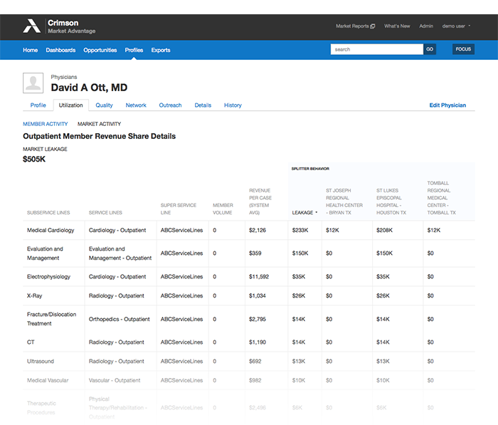
Consultants had informed the UX team that many clients were frustrated with our current Physician Affiliation tool. After conducting interviews with several Hospitals across the country, we learned there were real problems with the existing interface. In addition to bad usability practices (horizontal scrolling, hierarchy & labelling), the page didn’t provide the level of insight users needed to make decisions. Comments such as, “I don’t care about the 1% and 2% . They’re not impactful…” indicated that the numbers being presented were not giving members the types of actionable next steps to make decisions. Another comment, “It’s too broad. Is there any way to drill down more?” told us that the presentation of the data was not providing the appropriate level of granularity.
Additional observations revealed:
- Lack of a consistent labelling was leading to confusion
- Poor wayfinding was preventing members from finding relevant content
- No way to identify a service line (needed more robust options)
- Visual cues showing important content were lacking (what is the data telling me?)
Discovery Sessions
Collaborating with PM and Engineering, I began to figure out the the current structure and content. We analyzed utilization patterns in Google Analytics and followed up with members individually about the challenges they had with the product.
We found that at least one high-profile member was hinging their annual renewal on whether or not this particular feature would be fixed, which put the pressure on us to make sure we got it right.
Methods used for Discovery include an Opportunity Canvas, Creative Brief, numerous white boarding sessions, prototyping, and card sorting with members.


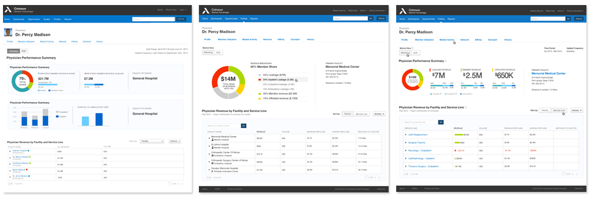
Iterative Designs
We worked through and tested a variety of concepts. We knew that to make the experience a success would mean testing and challenging everything we thought we knew about the product. To the Left are a series of early designs that tested several possibilities with users. The first explored the idea of providing summary data in a basic dashboard. The second explored an interactive donut chart with iconic grid elements. The third showcased a donut with related data associated with it. Option three eventually led to the final design.
Design To Production
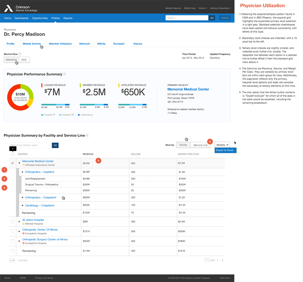
To communicate exactly the intent of the design to our Front End Engineer colleagues, we made sure we documented each and every feature extensively.
One of the more interesting discoveries during our testing was the way people navigated through the feature. Our observations revealed that members usually clicked the Utilization Tab, then Market Activity. From there, members clicked on Details under Total Revenue. That’s how they’d typically get to the Physician Utilization page, blowing past the Utilization summary page altogether. A proposed improvement we made to the information architecture was to move the Market Activity tab up to replace the current Utilization tab. This eliminated two extra clicks and more closely matched the members’ mental model.
Once we made the changes, got buy-in from stakeholders, we then converted it to the new Luna design style and hand it off for production.
Results
Through deliberate and measured processes we were able to identify key pain points and address them directly with members. When all was said and done, we increased traffic to the page by over 27% in the first month and convinced an important member to sign a contract for another 3 years. Here are a few key items that made the difference:
Navigational Improvements
By adjusting the way members find the information to make it more concise, we better matched their mental model and provided an easy way to get to the information they need.
Visualizations
Creating a summary area above the grid that spoke to the data without having to sift through it became the right fit for the problem. Members appreciated the birds-eye view summary which provided clear, directional information.
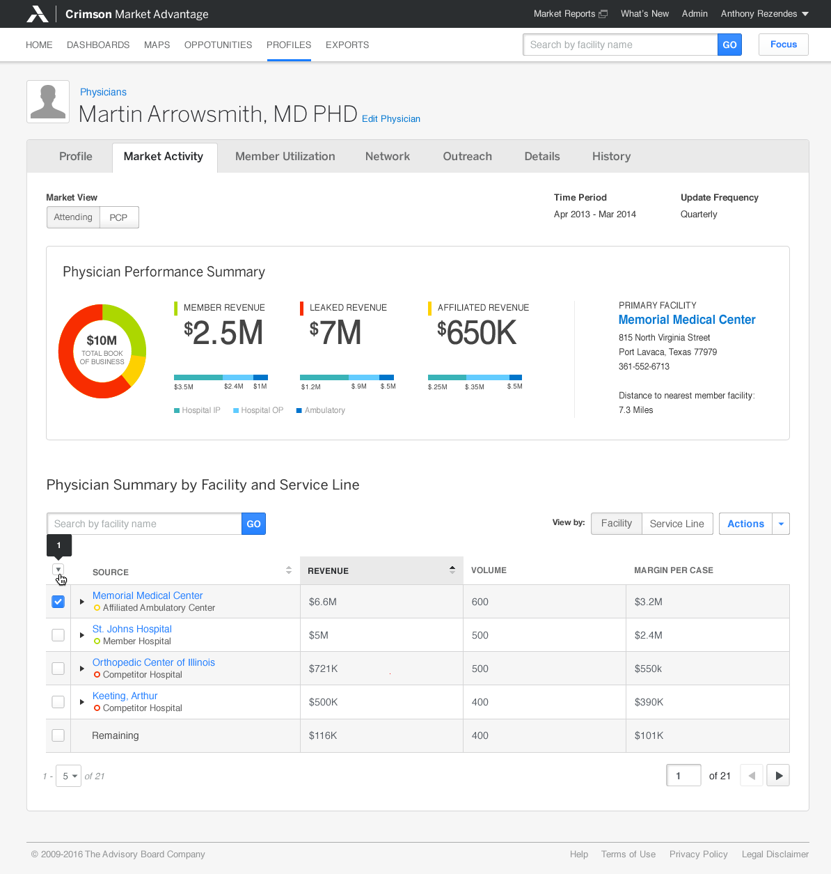
Expand/Collapse Table
This feature allows members to explore connections and expand/collapse according to the fidelity they needed. Each level differentiated itself either through line weight, point size, or background color to make each data point as obvious as possible.
Badging
At a glance information proved to be important. We conducted several user tests to see which style worked best and this one prevailed. Users liked it because it harkened to badging elsewhere, but is more subtle so as not to detract from the information being presented.
By The Numbers:
27
Increase in page utilization upon redesign
8
Different hospital systems engaged in testing
1
Important client relationship saved