With over 21 branded medical products, Crimson needed to keep its design language in sync as the company continued to grow. I spearheaded the transition to the new “Luna” standard for the company’s flagship product, Market Advantage (CMA) by collaborating with the Core Services team.
Reducing Costs & Building Trust By Refreshing The User Interface


Evaluation & Planning
I knew we couldn’t just append the new styles to the old architecture. Layouts would break, functionality may or may not work, and non-semantic CSS cobbled over the years would add to additional hierarchical confusion. These were risks that would have to be addressed on a per-page basis.
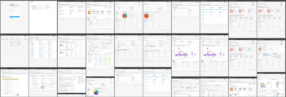
I started with evaluating how much effort the re-design would entail on each page. Working closely with our Front End Engineer, I was able to get a branch of our app with the new styles applied. This allowed me to conduct a UX audit of how drastically the pages were breaking without making any changes to the code. I created a 21-page report that showed the before and after, highlighting what needed to be changed
Research & Analytics
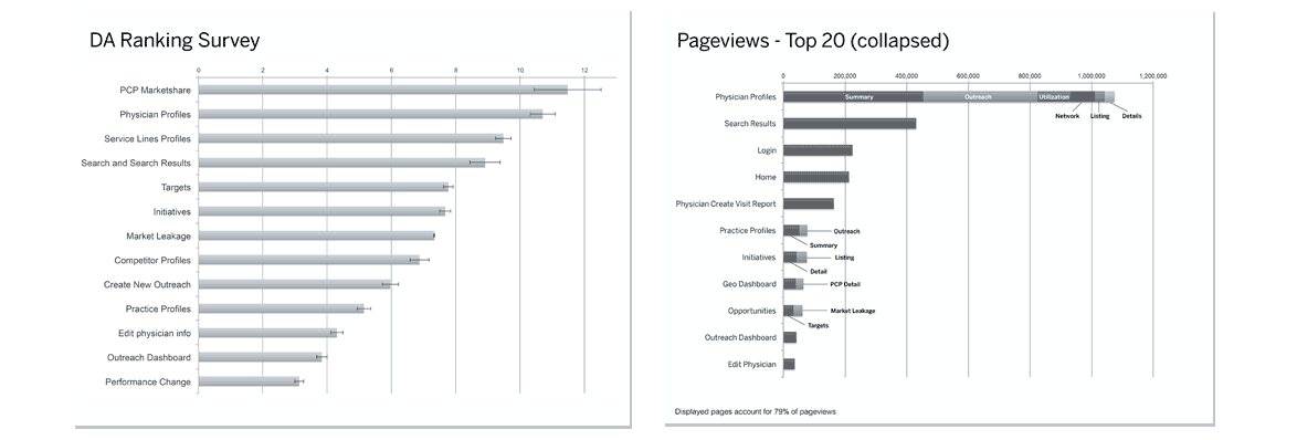
I then worked with my Product Manager and Developer to collect Google Analytics reports. We were able to come up with page view rankings for each month throughout the previous year and for the last three months. Simultaneously, surveys were conducted asking our Dedicated Advisors (DAs) and support staff what they felt were the most utilized aspects of our product based on conversations they’d had with members. This, combined with the Google information, allowed us to prioritize the pages accordingly and determine the effort for each. Below are artifacts of this exercise.
.
Divide & Conquer
We divided the design effort up into five waves starting with the most important (e.g. heavily utilized) pages first. Each wave included 6-8 pages that would be designed for each sprint. The tickets were input into Jira (our Agile project management application), and scheduled to optimize the design / development time. I stayed two weeks ahead of the Front End Engineer, collaborating with him on any UI issues that cropped up. One item in particular that wasn’t addressed in the static mockups was adaptive layouts, grid styles, and color palettes for visualizations. I worked collaboratively with our core design team in ensuring the look and feel matched their design spec and contributed back to the pattern library when applicable. All said, I created over 40 pages, numerous grid styles, color palette combinations, and graphics.
.
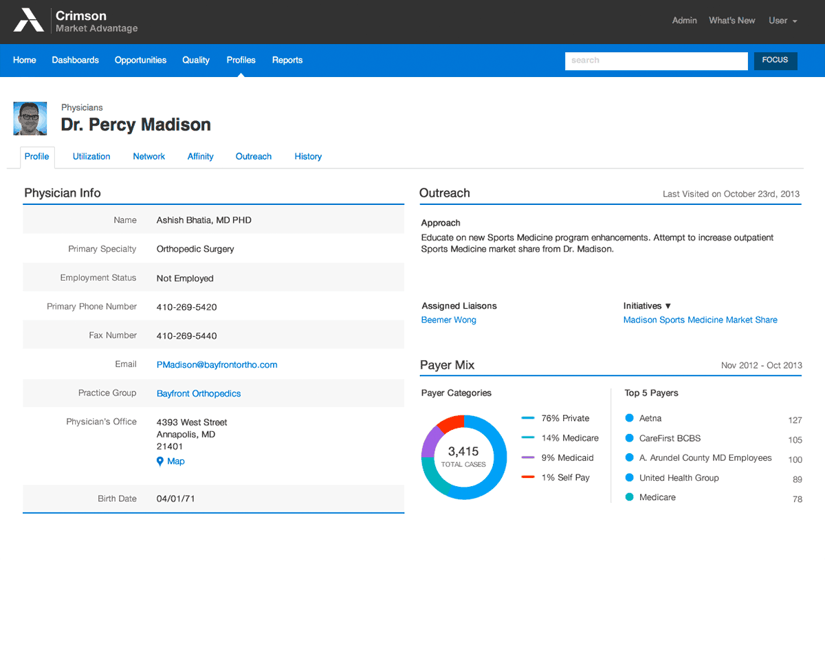
Old vs. New Comparison
Stylistically, the new design conforms to the standards negotiated with the core design team. Larger, easier to read typography and padding around objects allows the layout to breathe. Space around navigational elements such as tabs and buttons makes them easier targets, providing less manual dexterity to click. A thinner header and more contrast in color options provide more flexibility to accommodate the myriad array of layouts within each application.

Results
It can be difficult to quantify the ROI on aligning products to one cohesive design standard. We chose to measure it based on time saved (speed to market), Reduce Costs, and Brand Reputation. At the end of the day, if you can prove that you’ve increased your production capacity by not having to manage spaghetti code and your brand across an entire product ecosystem has been modernized to reflect the companies best thinking, then you’ve added immense value to the company. and to your customers.
Speed to Market
New, standardized library components increased UX team efficiency
Reduced Costs
Modular approach eliminated rework and reduced custom development costs
Brand Reputation
Three in four members said new layout influenced positive brand attitudes