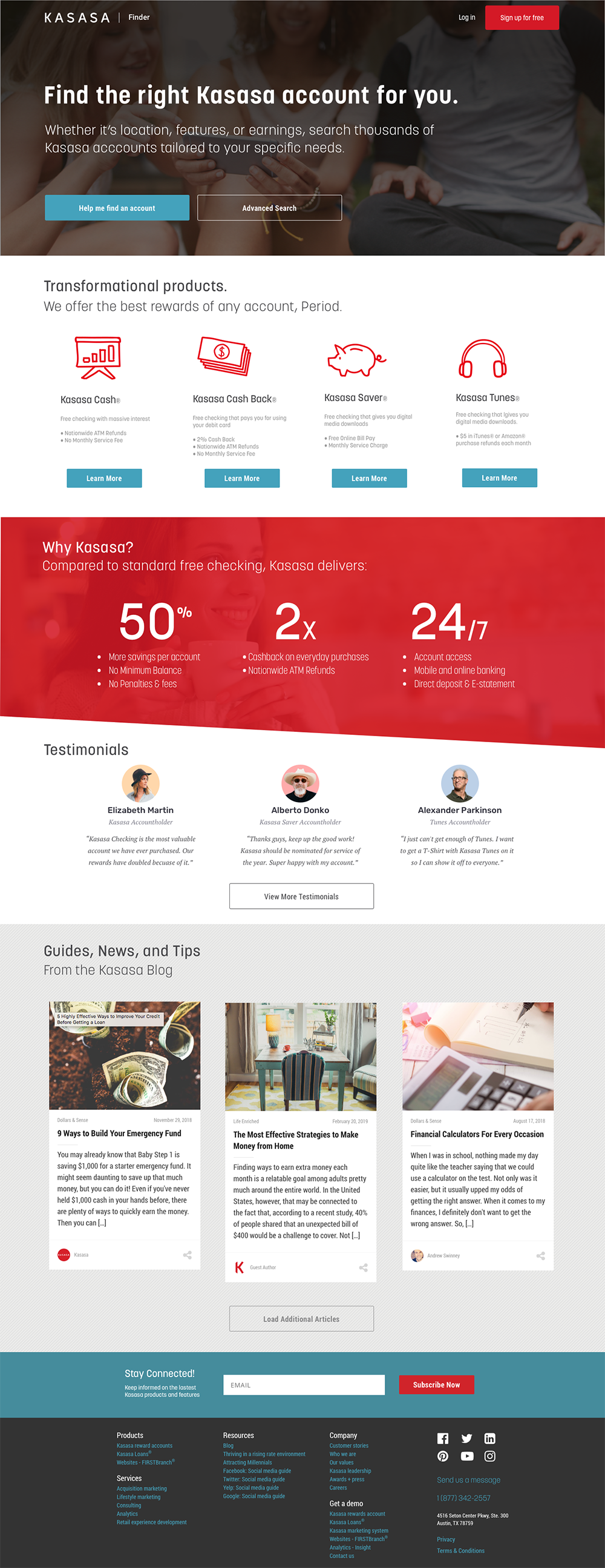
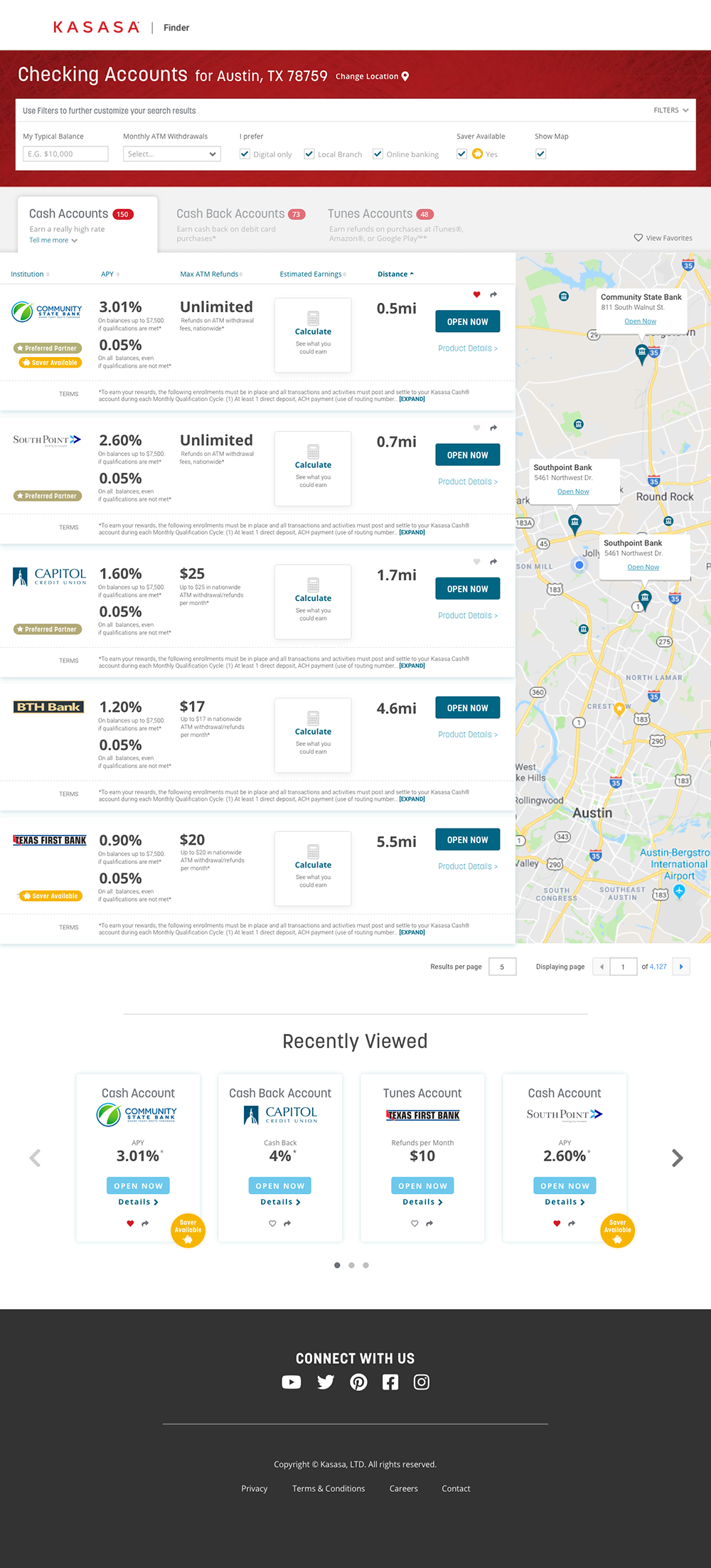
New Rules, New Opportunity

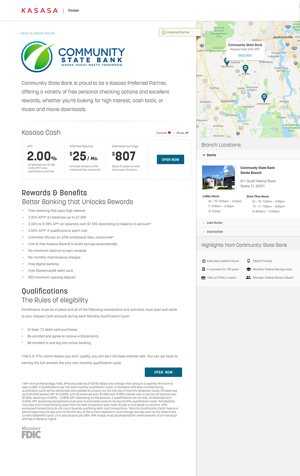
Recent changes to an intrenched federal rule that classified promoting Kasasa clients on Kasasa.com as a deposit brokering had been re-examined.  It was determined that the company did not place deposits directly and acted simply as a facilitator to financial institutions. This meant the company’s ambition to create a portal site for which consumers could actively review offers from various financial institutions was now a possibility.

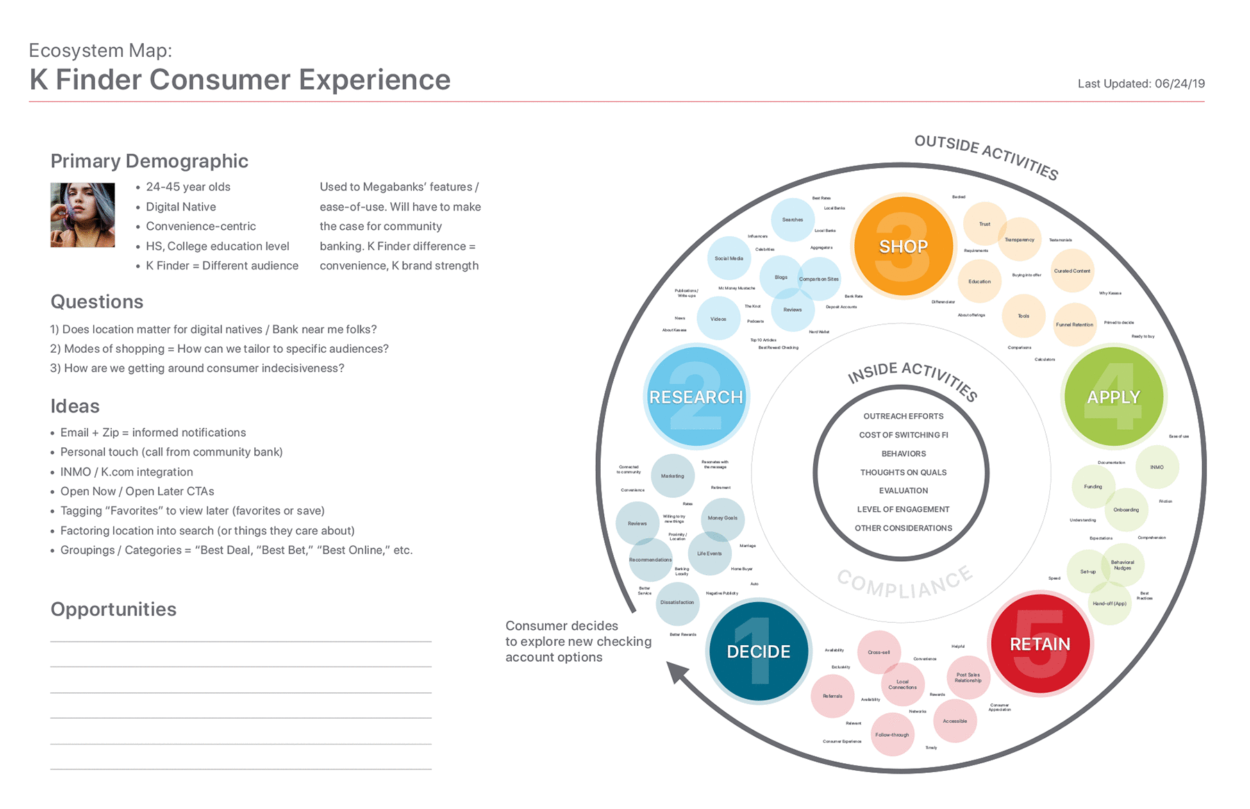
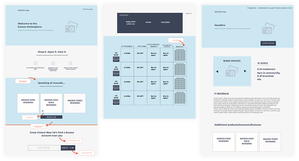
I began tackling the project by better understanding current process flows. This meant collaborating with our business stakeholders to better ascertain where the greatest opportunity lie. Not only did this require whiteboarding/working through proposed approaches, but also understanding the journey from a buyer (consumer) and seller (financial institution) perspective.

Understanding The Buyer Ecosystem

I refined our initial white boarding exercises into an artifact that we could hang on the wall and evaluate. It gave us a chance to work through some of the opportunities that lay in front of us while being focused on the end users. This comprehensive approach gave the entire team better understanding regarding how each piece of the puzzle fit together, from Marketing, to Sales, to followup and lead generation.

Primary Buyer Ecosystem

Competitive Analysis

It wasn’t enough for us to create our plan in a vacuum. I initiated a competitive analysis effort that thoroughly reviewed our top competitors from a consumer, client, site traffic, and usability perspective. We interviewed consumers about their experiences with other products. We spoke to clients about what works for them. Furthermore, we dug deep into competitor insights to uncover gaps. We also evaluated our own website design against what currently exists in the marketplace.

While highlighting areas that competitors were under serving, the effort revealed several areas in which we needed to improve on our own site to have a realistic shot of making this a success.

Indirect & Adjacent Competitors

Leveraging what consumers are already familiar with is core to building a great experience. We took a look at companies that consumers mentioned during our interviews to uncover micro trends and gain a better understanding of what seems to be working for them.

My presentation included evaluating features that appeared across the product landscape but that weren’t necessarily targeted or owned by a specific industry. This helped us get a better sense of user expectations and gave us a sense for how each stacked up in comparison. This helped inform our backlog and gave us additional avenues to explore when it came to feature prioritization.

Wireframes

Figuring out the layout was a combination of industry best practices and understanding what our consumers were looking for. Our efforts started as interactive whiteboarding sessions in which we’d collaboratively draw what we thought the site should include, then we boiled it down to a more refined (digital) version once we had consensus. Not satisfied with our efforts to this point, we opened it up to teams from other departments to comment / critique via post-it notes and digital comments through InVision.

wireframes

For the main Kasasa Finder page, I knew we had to provide multiple avenues for potential consumers to engage with the content. Therefore, I led by providing two options: A help wizard button or an advanced search button. If they chose the “Help me…” option, they’d be greeted with a wizard modal that helped them narrow down their search before showing the final results. The advanced search would allow bring them to a search results page within which they’d be able to filter on specific criteria.

For visitors just perusing the site for the first time, we needed to sell them on what Kasasa products are. I broke the page down into chunks that would appeal to various stages of the consumer onboarding experience. Providing explanatory information about each of the products was the first step, then giving them an understanding of why Kasasa products were better than anything else in the marketplace mirrored what they were seeing in the marketing.

Wizard modal example

Third, we introduced social proof. Testimonials of real users and their experience with the products really told the story of how account holders felt about the Kasasa rewards platform. I then proposed helpful articles to round out the page that included content from the Kasasa Blog.

Realizing that not everyone coming to the site was there to make a decision today, I felt it important to introduce a way they could engage with the content via an email subscription. Not only would this help them stay informed, but it would also provide a means for follow-up should it be needed.

Once visitors had completed going through the wizard, they’d be brought to the Search Results screen. Here, they’d see a list of options that were available to them based on the criteria they chose in the wizard. The top of the screen is devoted to a filter area (which can be collapsed) to help them further refine their search. If they elected to skip the wizard, they’d be brought to the same page with the default selections enabled.

Kasasa product categories such as Cash, Cash Back, and Tunes are presented as tabs in the search results section below the filters. In addition to reminding them of the benefits of each product, these sections contain sortable tables for instances in which visitors wanted to sort by distance, APY, institution name, etc..

Each row of the results was broken down by feature. We tagged the Institution on whether they had additional availability (such as Kasasa’s Saver savings account) and if they were a preferred partner. Preferred partners were given more customization options in the UI and preferential positioning in searches.

A main draw in our user testing was the map view. We provided the ability to pan based on clicking and dragging on the desktop, with eventual zooming and full screen mode scheduled for later releases.

Rounding out the page was the “Recently Viewed” area, which provided a history of where the visitors had gone. Clicking on the details link would bring them to product details, while clicking on the “Open Now” button would bring them to the Financial Institution’s online account opening system.

Drilling into any particular financial institution’s offer on the site would bring the visitor to the product details page. This page contains high-level information about the institution and specifics such as Rewards, Benefits, and Qualifications.

Similar to the Search Results page, the right side was reserved for supplemental information including the Map, Branch Locations, and Highlights for that particular institution. The page defaults to the primary branch with accordion-style expand/collapse areas for specific branches.

Visitors can share this detail page using the Share icon adjacent to the product, however the primary action at this level is to open an account. We intentionally left off contact information for the institution, as we wanted the site to be the primary driver of account opening.