Client:
TASB Risk Management Fund (TASB RMF), is a self-service risk pool focused on keeping public education organizations healthy and safe places to learn and work. It’s one of TASB’s largest entities and plays a crucial role in serving the state of Texas when it comes to assuring the safety and well being of Texas school districts, community colleges, and other education organizations.
Task:
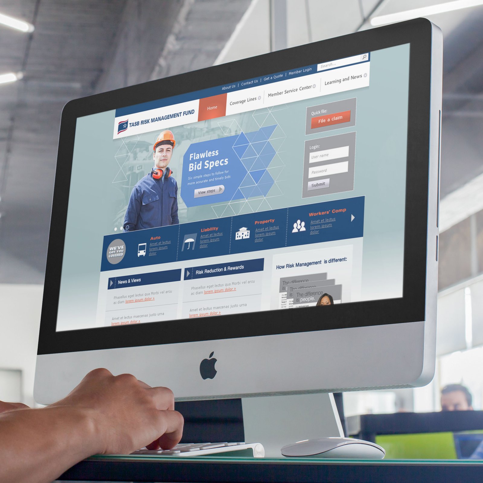
My team was responsible for redesigning the site from the ground up to meet members needs in a way that reflected the evolving nature of the expanding services the Fund offered including Auto, Liability, Property, and Unemployment Compensation. The old site had many usability flaws including poor wayfinding, scrolling navigation, tooltips on top of buttons, as well as several fundamental problems relating to content organization and structure.

The original RMF site sported many usability & wayfinding issues, not to mention accessibility challenges that resulted in numerous support calls & frustrations by visitors.
Research & Discovery:
We started with an evaluation of the site as it existed at the time. We conducted a SWOT & Competitive Analyses, extensive user testing (both internally and externally) in addition to identifying primary, secondary, and tertiary personas. Once we had a direction, we created mood boards to capture the essence of what the brand represented. We then married some of the effort we were working on in the print side to create a cohesive design that spoke to what both the members and the company were wanting.
Interviews were conducted through major events such as The RM Members Conference, during which we’d dispatch teams to conduct focus groups, user testing sessions, and surveys. These proved invaluable to get real-world feedback.

Information Architecture & Wireframing:

A major undertaking was reworking the information architecture which had become an impediment to users reflected in high bounce rates on the site. We knew we wanted to improve the process and conducted several tests to uncover pain points. After reworking the sitemap, I wireframed out all of the critical pages, getting a sense for what elements could be componentized and what pages could become templates. Improving the responsiveness of the site was a priority as our analytics showed that, though modest, mobile was a growing segment month over month.

Design Options
We also knew we wanted to go beyond the existing iteration, which was a static, one dimensional site into something that met members where they where. We knew we could accomplish this by having a flexible layout that would accomodate a variety of devices. First & foremost was coming up with several modern design options that we could present to the team. I had my team working on a variety of prototype mockups that showed functionality in addition to expanding some of the functionality into areas that were important to members. Here are three of my proposed layouts.

Result:
When the site was launched the team saw may compliments on the final result. Members were able to find content easier and staff were not burdened by an antiquated design that didn’t reflect the direction of the new branding & marketing efforts. Support calls were reduced by 52% and access on the mobile platform grew due to a more accommodating, accessible presentation. While they’ve transitioned to a different CMS since our first redesign, the information architecture and the fundamental changes we introduced to the structure of the site remains the same.
