Market Microscope is based on patent pending technology that allows Advisory to blend hospital claims data with patient demographics data. The team came up with a way to create views of physician and facility activity for shared patients with specific procedures, diagnosis codes, and even anonymized granular data such as age, sex, and zip code.
Uncovering Physician Connections By Analyzing Anonymized Claims Data
")

Discovery, Opportunity, And Mapping
To fully understand the market for this particular tool, I led the effort in fleshing out an Opportunity Canvas with the team. Because this was a new source of value for the company, the goal was to get everyone on the same page with regard to why we where undertaking the effort to create it, what the goals and measurements were, etc..
Since some of us had been part of an earlier white boarding session that included a dialog on the business goals, it was a chance to share what we knew about the project with the larger team. The hand rendered, post-it note exercise was translated into the a google doc template. I wanted the team to get a feel for where Market Microscope (also codenamed NE-1, Network Explorer/Manager, and later PCA) fit within the space from a buyers perspective. I employed an Ecosystem Map to help connect our products and services to our members’ mental model. The map also takes into account other solutions that are part of the users’ intrinsic and extrinsic activities. These artifacts became a reference for guiding product discussions and set the stage for continual iteration and collaboration.
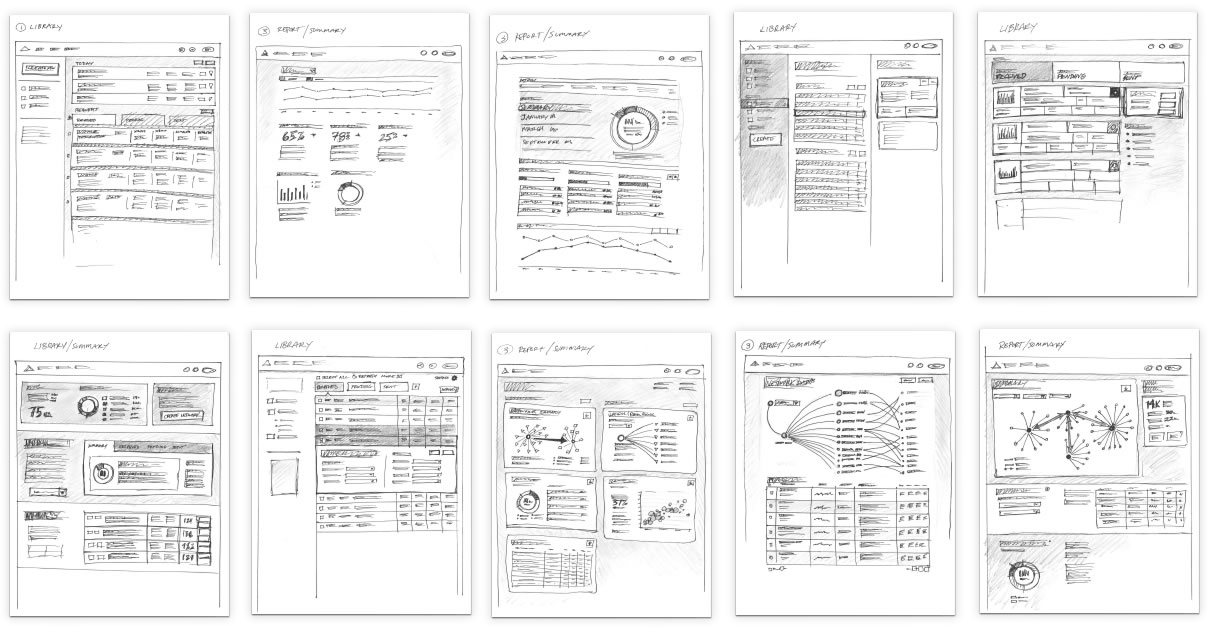
Preliminary Pencil Sketches
While the back-end was building out a proof of concept for creating Physician Activity Reports manually, I was imagining the tools potential UI. Initial, first-pass sketches were created as a way for me to visualize the possibility of what the Market Microscope tool could be. As an exercise, it provided a way to communicate what types of information we still needed prior to much of our documentation. It also got us away from the constraints of what we can do today from a functional perspective and started a conversation around potential aspirations beyond MVP.
Strategic Planner Persona
We partnered with a handful of hospitals to better understand what experiences mattered most to them. In one case, we flew out to University of Washington Hospital to meet with Lauren, a program manager, to share the results of her manual report request first-hand. In addition to ascertaining the value of the data, this provided an opportunity to show her early prototypes. It also allowed us to better understand the context in an office setting, get a sense of motivations/expectations, identify gaps between channels, and put the user front and center. We used it as an opportunity to listen to any feelings or needs that may not be being addressed currently.
The testing revealed several nuances in her process, including that she receives 2-3 requests a week with quick turnaround times. She must then go through a review process with her director before she presents it to to larger workgroup. They’re also creating report presentations from scratch (not presentation templates) and don’t go back to old reports. When it came to the expected output, one quote we received was, “There’s a forensic need for detail. It’s obsessive and prohibitive at times. You have to tell the story from front to back.”


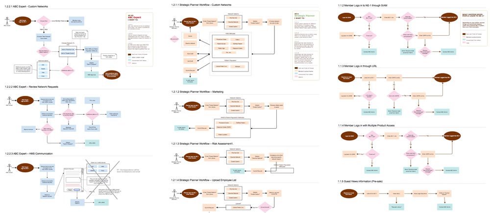
User Stories & Use Cases
We continued reaching out to member hospitals and crafted User Stories based on actual report requests. They all had the same cadence and often began with, “As an [analyst or strategic planner] I want to know [specific information about a demographic] in [a specific diagnosis, procedure, and/or location].” After several were created, I began building Use Cases that documented the flow of each story (below). These Use Cases were explicit steps that the user would go through to accomplish each task. These provided a way for us to dig deeper into whether or not the proposed workflows were making sense before a lot of time was spent designing and developing them.


Wireframes & Interactive Prototypes
Although some aspects of the final screens where still being determined, we did have a clear understanding from the sketches and continuous conversations that the wireframes would initially be made up of three screens: A InBox, the Create screen, and the Results screen. I began formulating some ideas around the layout based on sketches, User Stories, Use Cases, and further discussions. Dozens upon dozens of wireframes were rendered in Gliffy then uploaded to InVision. From there, walkthroughs were created and tested with members to uncover what was missing. We tested early and often, but never with more than 3-5 people per testing exercise. The goal for the user tests was to determine whether or not members could understand every aspect of the designs without being prompted.
Understanding Health Care Consumers
For Strategic Planners in healthcare, calculating their potential revenue in all outpatient services, understanding their competitive position in their market spaces, and tracking key metrics – like top services rendered and payer mix – form the foundation of what they do regularly.
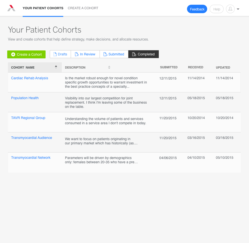
With Market Microscope (formerly Patient Cohort Analyzer) I created a UI that allows them to compare market share for current and potential locations, all by creating and submitting a form. This gives them increased transparency into consumer behavior in their market and the ability to analyze their prospects.
Through a familiar In-Box style interface, they can track various scorecard reports they create, create drafts for later editing, and submit it for review. They can access rich detail on sample size to allow them to see where initial questions missed the mark.
Uploading and Compiling Multiple Sets Of Data
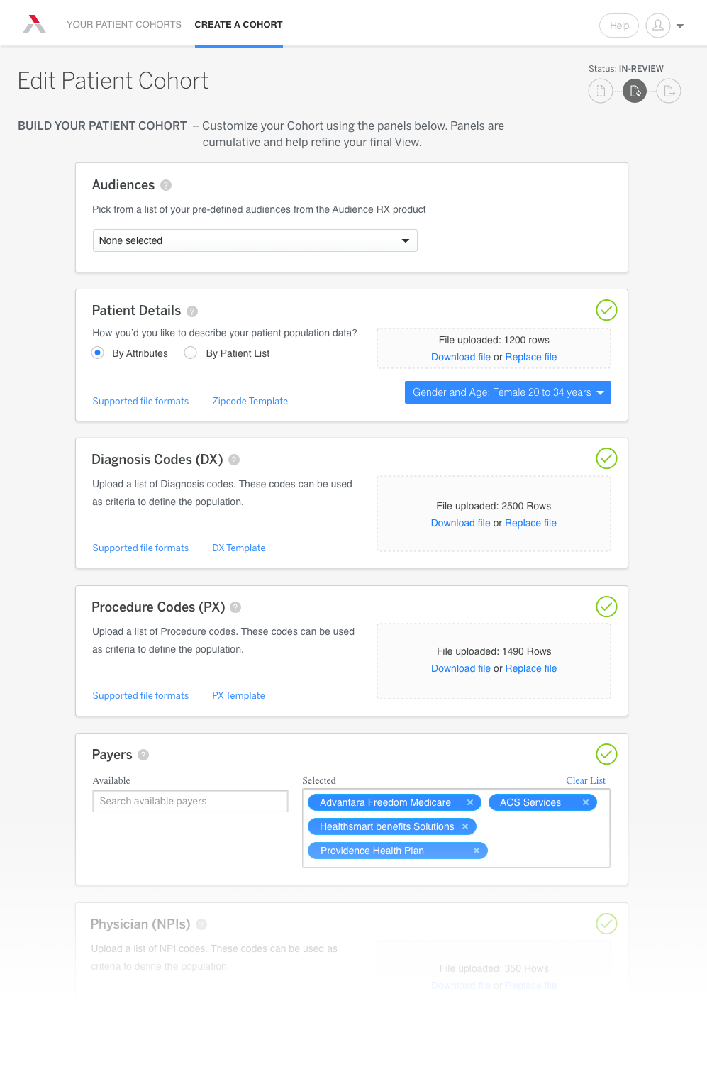
By going through a series of steps, Strategic Planners can help their facilities plan for the future. For example, if they’re looking to understand where they should build a sports medicine clinic, the tool helps by providing a market overview to understand their competitive position in each market and potential revenue in all outpatient services. It does this by building a patient specific market analysis for both locations and compares current market share, total volume, top procedures and payer mix, all through various data that get entered into the Create Cohort screen.
To provide the most comprehensive information possible, tooltips reveal a more detailed description for those less familiar with technical medical terminology. For experienced strategic planners (primary use case), the UI has been streamlined for them to get in and fill out the components as quickly as possible. During our testing, we discovered that users preferred a longer form they could tab through vs. a wizard style interface. They also wanted a visual way to know if the data they attached to each section was accepted, hence the green confirmation checkmarks.
The edit screen (shown) illustrates the ability for users to make modifications to their drafts.
Detailed Patient Profiles Users Can Refine
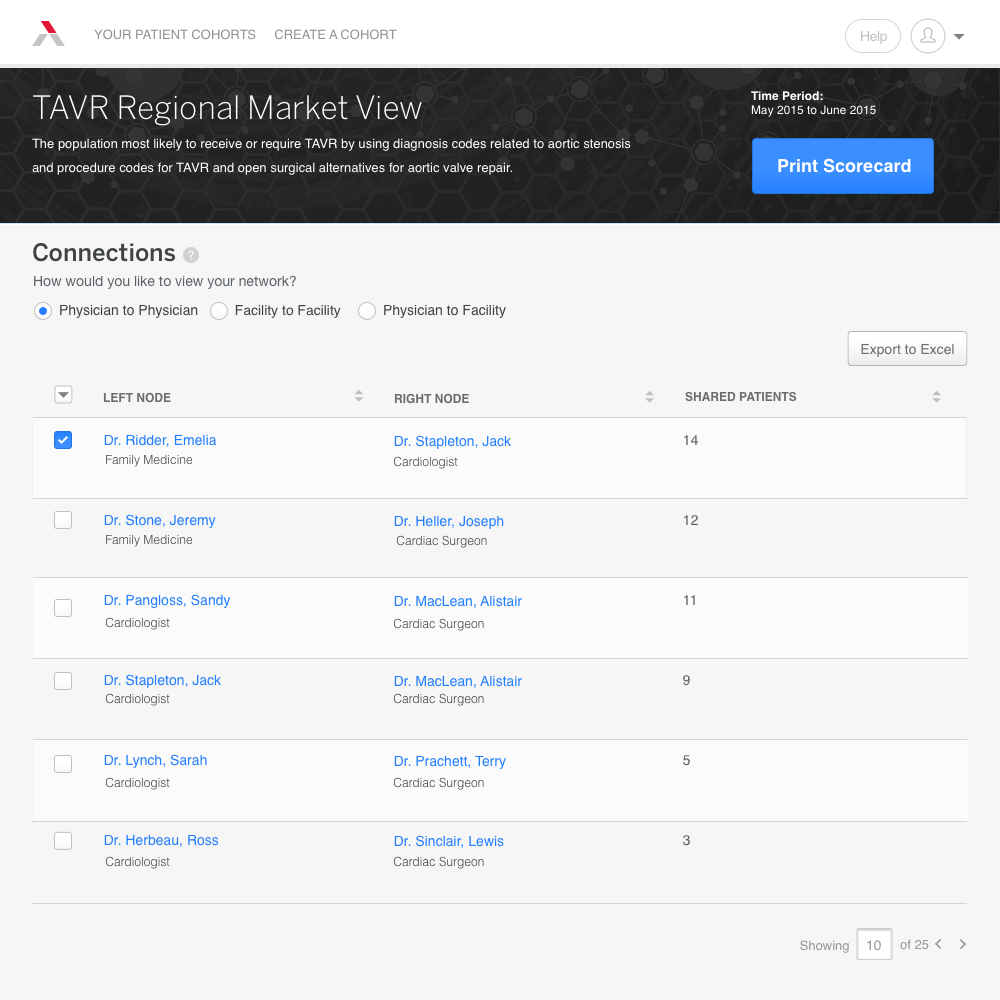
In its simplest form, the Results Screen can tell you connections information as shown to the left.
In this example, you can see which PCP physicians are sharing patients with specialists downstream. If, for instance, your facility has noticed that they are losing money (also known as leaking) to physicians outside of the network, you could analyze which physicians you’d need to have conversations with about referrals. The patient data is always anonymous and when sample size gets to a point where it is conceivable that you could infer patient information, the UI intelligently conveys that to the user. Here, you can see the various ways you can view the information: Physician to Physician, Facility to Facility, and Physician to Facility. All Physicians have drill-downs in which you could pivot on various criteria. It was important to our persona that the UI have a prominent way to print out (and to a lesser degree export) the findings, as they often review it when they’re away from their machines and appreciate hard-copies.
Further Refinements
Through additional research with users, we ended up evolving the Results Report to include deeper dives into the data. As you will see in our final iteration below, a rich story can be told by adding summary information throughout each progressive step into the findings. The initial design was fully realized using Sketch, then as the product evolved and we needed to see more of how the interactions would work, I brought everything into Axure. This provided the flexibility I needed to test how the interactions were working without getting into the complexities of how to actually create the interaction in HTML. Many of the revisions we were able to make were made on the fly and pushed out to the shared servers.
Results
Going from a very hands-on, manual process of creating reports for members to more of a self-serve model wasn’t without it’s hiccups. While the company continually maintains member access to their R&D data science team to help hone questions in the language of each data set, giving the ability to run reports and ask questions of the data is an incredibly powerful proposition for members. Because of it, we were able to increase annual renewals by incentivizing members with a free report.
But the most telling aspect was a story we heard from one of our Strategic Planner partners. He said,
“I shared the deep brain stimulation data with the physician liaison for Neurosciences and we found two outreach visits for her to do promptly – potentially converting several future patients and if all goes as we hope, increasing our surgeon’s volumes by over 50%. VERY promising.”
Additional data is as follows:
Increased Utilization
% of membership currently engaged as of its second release
New Traffic
Increase in new visitors based on the latest release statistics
Reduced Attrition
Percentage of total attrition reduced with 21 hospital relationships saved