The old Kasasa Loans App

Leveraging What Works

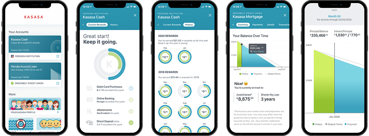
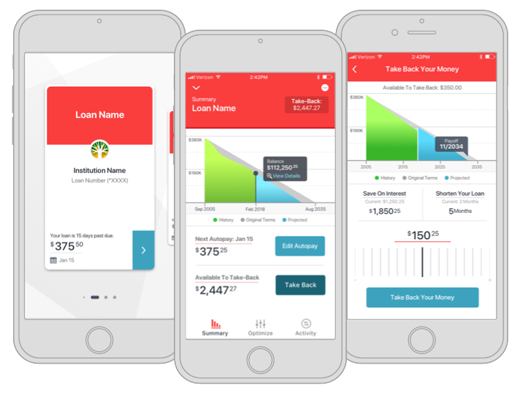
One of the biggest challenges is maintaining and building upon existing successes. With the Kasasa Mobile App, we were coming off of a Kasasa Loans application that 9 out of 10 customers preferred. Touted as the “Best of Show” during Finovate 2018, the app offered unique features that many of its competitors lacked. Understanding what consumers and financial institutions liked and didn’t like about the current product in addition to building in new tools & features meant defining both consumer and client needs up front.

Some of our clients (banks and credit unions) felt that our “brand-first” posture within the app (Kasasa red as our primary color for example), competed with their own app. This introduced a level of friction when it came to providing the Kasasa application alongside theirs. Additionally, Kasasa had a variety of products such as Reward Checking and Savings accounts that consumers told us they wanted to be able to access within the app that weren’t currently represented.

Evaluation & Wireframes

The architecture that the original app was built upon wasn’t designed to scale to a variety of products, which meant we needed to re-think how we wanted the interactions to work. We knew that in order for financial institutions to feel like they owned the relationship to the consumer, we needed to cater to their needs just as much as the consumer. Luckily, we had a secondary color scheme we could lean on that provided a more neutral palette. Before we could tackle the look and feel however, we needed to address the information architecture.

We reinvented the way the application flows connected users to their content. I established a methodology for how interactions would work, learning from our successes with the old app and feedback we received from consumer interviews. Combined with Use Case documentation, we began fleshing out the structure.

Secondary color palette

User & Client Centric

We leveraged the secondary palette throughout the UI, allowing the content to speak more than our branding. This put clients at ease while also giving prominence to the accountholders’ data – something consumers told us mattered to them. Financial institutions liked it because it was more subtle.

New Kasasa Application Lineup

Gestural & Immersive

To optimize the experience for native mobile, we intentionally steered away from what other apps were doing in so far as mimicking interactions from the desktop. Many competitors were still using what looked like an electronic version of an accounting ledger. We definitely wanted to steer away from that notion if we were to create a more forward-thinking experience. Instead, we decided to make the experience feel immersive and native to the device. Internally we called it the “In a World” experience because it relied on gestures and swipes from screen to screen instead of pulldowns and menus.

Doing some guerrilla user testing revealed that people liked the new experience compared to existing banking experiences 5 to 1, with one commenting, “It feels elegant and better than anything I’ve seen in a [mobile] financial app.”

Example Flow: Nuances of Sign-Up

In some respects, the easiest screens are the ones that customers use regularly. There’s a lot of data on what they need and how they use it. In contrast, knowing where people are more apt to drop off in the online sign-up process can be more challenging. The new voice & tone we were setting for the app was smart & succinct with a sense of humor, therefore we wanted the signup process to reflect that same cadence. Eschewing traditional forms that can be long and tedious, we went for a more conversational angle, asking for bits of information as they completed their process so that the perception was a smooth and seamless experience.

There’s rhythm & repetition in the way the screens animate and how they alternate from the teal to dark grey between each section. The perceived time it takes in filling out the form feels like less time than traditional forms because the UI keeps things moving.

Kasasa App (KApp) profile flow

Project Stats

Validation of our work came in the form of the 2019 and 2020 Finovate awards, once again showing that listening to clients and consumers is the right move. We’re constantly iterating on the product, however the statistics from our efforts thus far speak for themselves. As we continue to test and refine, we’ll undoubtedly help our clients and customers by continuing to put them at the center of the experience.

52

Higher overall balances

39

More loans per borrower

84

Net Promoter Score