Meeting The Need

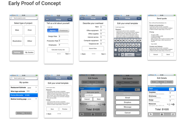
The idea for Quote Roper was borne out of a universal frustration designers have with people randomly asking how much a given project would cost or how long it wold take. This scenario frequently occurs within in-house design teams where consultants need to estimate work, or in a freelancer setting in which clients need a quick ballpark estimate to understand if the work they are requesting is within budget. An early proof of concept was tested with a handful of potential users and it was determined that something lightweight and mobile-centric would be the most ideal solution.

From there, a sitemap was drawn up focusing on the main sections of the tool which included a set-up area, create estimate area, and the estimator portion of the app.

A Recipe Sheet For All Needs

The strength of the app would hinge on how extensive the list of projects was and if it encapsulated the needs of our primary and secondary personas (designers and creative professionals). Taking inspiration from a cookbook, the project “recipes” were first input into Google Sheets, using standard price calculation tables from agencies and other sources representing hundreds of projects across a half dozen industries.

To represent the projects in a visual and memorable way in the app, custom icons were generated that embodied project types including print design, web (online) design, photography, and illustration. The app would later expand to include custom lists either uploaded via CSV directly to the app or linked from a personal Sheets file.

Branding & Aesthetics

The name Quote Roper was chosen due to its Texas roots and is a play on the phrase Goat Roper, meaning someone not from around these parts who doesn’t quite get it. Taking that concept in a playful direction, cowboy-themed, illustrative characters were developed that captured a fun and inviting spirit. The app’s palette was warm earth tones with green and blue highlights.

The “Q” emblem doubled as a lasso and is used during the loading sequence and as the app’s icon. The characters and illustration style were extended to email and print campaigns as well as for the beta program where participants would be given swag that reflected the artwork. Other collateral, including business cards and t-shirts rounded out the look and embodied the spirit of the folks who use it.

Design & Production

Once the style and artwork was generated, prototypes were created and shared with the beta team. After further refinements, final screens were put together, then shared with the development team. In order to ensure a smooth transition, I made sure to articulate how each screen would function. Assets for all of the screens were exported and packaged up according to the developer’s spec.

Working with a 3rd party developer required a meticulous attention to detail right down to pixel spacing, colors, font weight, and positioning. I conducted weekly review sessions where we’d go over design elements that needed to be tweaked, any relevant problems so far as building out the app and additional considerations that would work better in code. Since our target mobile device was iOS, we focused on the best experience for that platform.

Website Design And Final Delivery

Once the app was available and ready for download in the app store, it was time to make the site live. Using many of the assets I had generated over the course of the development process, including an impromptu photoshoot with a co-worker using the product, I put together a site that highlighted the benefits of the tool.

Each section either showcases a particular feature (or set of features) to hopefully entice visitors to take action. In addition, the site includes several blog articles on working as a freelancer and how to understand your value.

Overall, the product was a success, garnering many positive reviews in the app store (average rating 4.3). Next steps will be to update the app for more modern iOS devices and possibly port it over to the Android platform.